The Carriage House – Brand Identity Overview
The branding for The Carriage House captures the warm, nostalgic charm of a vintage wood-fired pizza experience, elevated with rich textures, ornate typography, and a color palette that speaks to both comfort and craft.
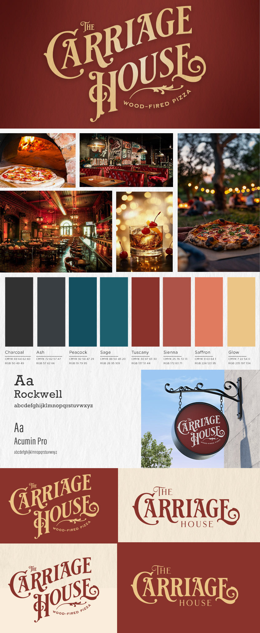
The logotype is the star—an ornate, custom wordmark that blends turn-of-the-century elegance with rustic personality. The swirling, serif-laden typography draws from historic signage styles, evoking feelings of heritage, warmth, and artisanal tradition. Paired with the tagline "Wood-Fired Pizza," the brand instantly positions itself as a high-quality, experience-driven dining destination.
The color palette enhances the sensory experience: deep reds like Tuscany and Sienna mirror fire-roasted ingredients and glowing embers; Peacock and Sage offer balance with cool, moody contrast; and the lighter Saffron and Glow hues provide cheerful highlights reminiscent of flickering candlelight or golden crusts.
Visual storytelling is further supported through atmospheric photography—dimly lit interiors, glowing outdoor gatherings, and rich textures all build a brand experience that is both cozy and elevated. The imagery invites customers into a timeless space that feels both intimate and celebratory.
Typography choices—Rockwell for headlines and Acumin Pro for body text—strike a balance between bold character and modern readability. Rockwell’s sturdy slab serifs reinforce the brand’s grounded, old-world feel, while Acumin Pro ensures clarity in supporting materials.
From signage to menus to social visuals, every element works in harmony to make The Carriage House feel like more than a restaurant—it’s a destination steeped in story, flavor, and ambiance.