Elk River Realty – Branding Overview
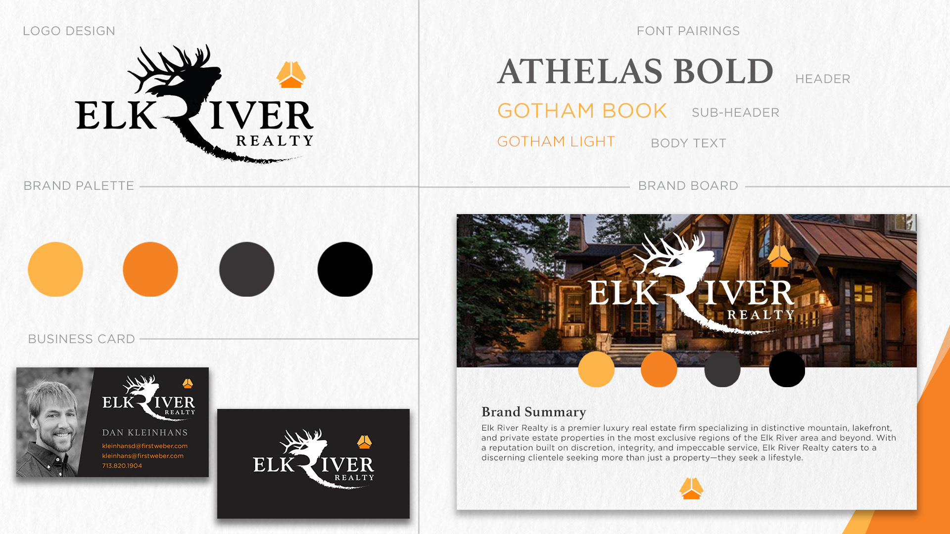
The branding for Elk River Realty captures the essence of luxury mountain living with a bold, nature-inspired aesthetic that appeals to high-end clientele. At the heart of the visual identity is a custom logo featuring a majestic elk silhouette seamlessly integrated with a flowing river motif, symbolizing strength, movement, and a deep connection to the natural environment. A sophisticated serif typeface, Athelas Bold, anchors the brand with timeless elegance, while the modern Gotham font family provides clarity and approachability across sub-headlines and body copy.
The brand palette combines warm earth tones—burnt orange, golden yellow, charcoal, and deep black—that evoke the richness of wood, stone, and firelight often found in luxury rustic architecture. This grounded yet vibrant color scheme reinforces the company’s positioning in upscale mountain and lakefront properties.

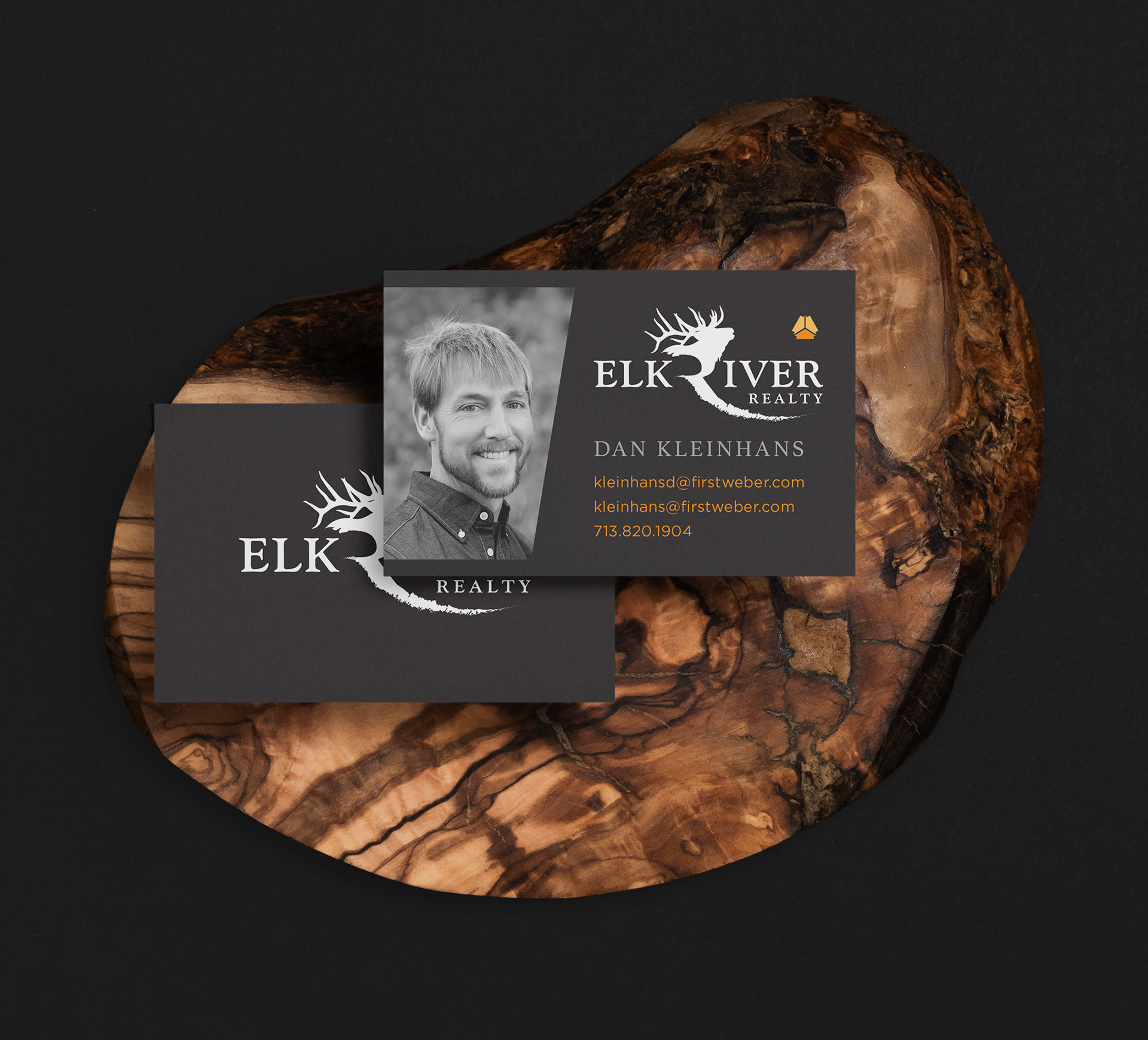
Supporting materials such as the business card and brand board imagery reflect professionalism and warmth, integrating high-quality photography with clean, confident layout design. The consistent use of iconography, particularly the geometric house emblem, provides a recognizable and scalable brand mark.
Together, these elements present Elk River Realty as a refined, trustworthy, and regionally rooted real estate firm that understands the lifestyle aspirations of its affluent clientele.